Table of Contents
You are really telling me, you never heard of Urban Fonts before? Well, considered how large the web is, this might be true and not a matter of faulty memory. The good news is: you can always get to know them now. They have published a useful infographic and still offer around 8.000 freeware fonts. So go there for more than one reason…
Urban Fonts Provides Thousands Of Free Fonts
I personally know Urban Fonts since the beginning of time. We were swimming the primeval soup together. I became a man, they became a type foundry. Caprice of fate.
Seriously. I first noticed Urban Fonts about six years ago. Being still around on the fast moving internet does mean something. Obviously, Urban Fonts did things right. Still, most of the portfolio on Urban Fonts are freeware fonts in formats for Mac and Windows, as there are TTF or OTF. License files are part of every download. So make sure the font you are going to use carries the proper license to let you.
Besides fonts from the freeware, premium fonts are available, too. Also there are fonts who demand backlinks, donations or any other token of appreciation the respective creators demand for. As I said, each font is equipped with a text-file to inform you, so you won’t find yourself dashed against the wall in the wrong moment.
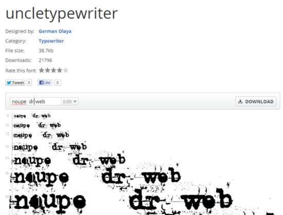
A nice feature for users looking for letter-sets other than English is the possibility to type your own text on the preview page of each font. That way you can check if a given font is worth to be taken into consideration very easily and reliably.
Serif vs. Sans: The Final Battle In Typography
Besides offering a plethora of free and non-free fonts, Urban Fonts runs a regularly updated blog, stuffed with interesting topics from the world of typography. You should consider subscribing to their RSS feed, if you are into typographical content.
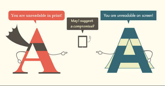
Just this past week the UF team published an infographics on the differences between fonts with serifs and those without. Titled Serif vs. Sans they put together the most important distinguishing characteristics of the two families.
They don’t limit the information to visible distinguishing marks, where obviously fonts with serifs carry – well – serifs, those little tailing lines around the edges of a letter. But they also explain the historical background as to how and why serif and sans fonts evolved.
If you are professional designer it will probably not be new to you, that still, serif-usage is advised for print, while sans-usage is advisable for web use-cases. So it is unsurprising that font usage on the web is 60% sans and 40% serif in headings, and even 66% sans in paragraph text, with only a share of 34% of serif.
Foremost because of the relatively low resolutions we still have to face as far as digital devices are concerned, sans is a better choice there. Serif fonts tend to brake and look brittle on resolutions lower than print. Even the coming hiDPI devices will have to go a long way to really be able to compete with a printed page of a book.
Put this infographic in your collection of infographics – I know you have one, if not, change that – to have it at hand when you next need it.

Related Links:
- Homepage | Urban Fonts
- Browse Favorite Free Fonts | urbanfonts.com
If you liked the article, do not forget to share it with your friends. Follow us on Google News too, click on the star and choose us from your favorites.
If you want to read more News articles, you can visit our General category.