#SocialMedia #Reggie Fils-Aime Stopped Nintendo From Changing Its Iconic Logo #BB
„Reggie Fils-Aime Stopped Nintendo From Changing Its Iconic Logo“
Reggie Fils-Aimé has revealed that he once stopped the marketing team at Nintendo from changing the company’s iconic logo, as there was a desire to appeal to a wider audience outside of its established family-friendly image. Nintendo is one of the biggest names in the video game industry, but the company has had several identity crises in regards to its branding and how it advertises to specific demographics.
Nintendo was once notorious for its censorship, as it tried to maintain a family-friendly image in the face of growing opposition to violence in games. This backfired on the company during the 32-bit era when Sony marketed the PlayStation towards an older audience and it defeated the Nintendo 64 in terms of sales. Nintendo started to loosen its censorship policies around this time and allowed adult games on its consoles, but the brand was still seen as being more for young kids than for teenagers or adults.
Reggie Fils-Aimé is the former COO and president of Nintendo of America and he is partly responsible for changing the company’s fortunes during the DS and Wii era. Reggie stepped down from his position in 2019 and entered formal retirement, but he has spent a lot of time appearing at gaming events and offering business advice at Cornell University. He was recently interviewed by the Present Value Podcast (which can be heard on Spotify) and he discussed the decisions he made at Nintendo when he first joined the company. According to Reggie, the Nintendo of America marketing team wanted to change the logo in order to make it appeal to a wider audience, which included a graffiti-style design.
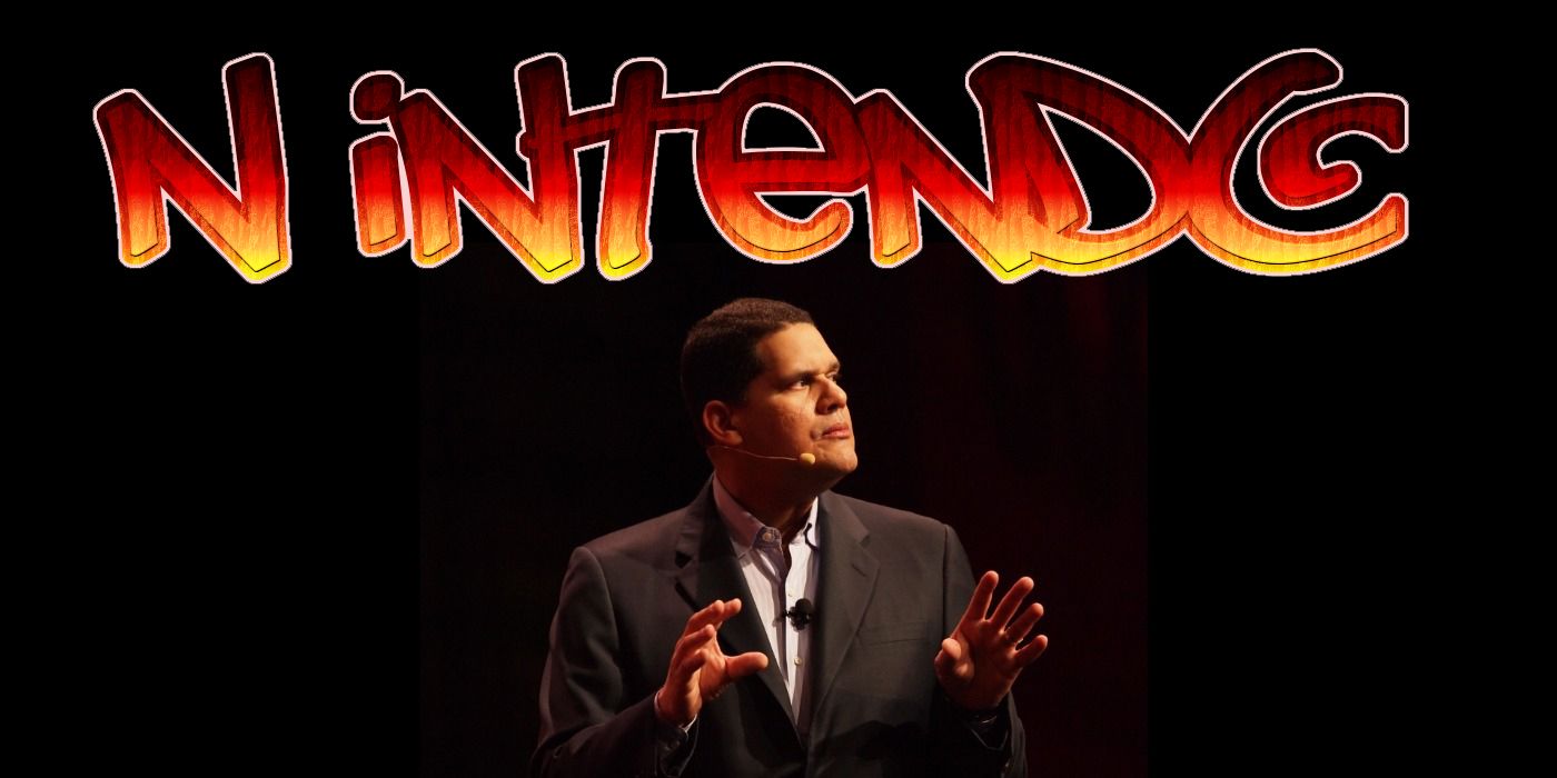
„When I joined Nintendo there was a sense of almost shame that Nintendo appealed to young consumers. And the marketing team at Nintendo of America started doing things with the logo, that classic Nintendo logo in an oval. They would put it in a graffiti style or they’d do different things to try and age up the logo, and I put a stop to that because that is not our brand. And what we needed to do was, yes, appeal to a broad swath of consumers, but we needed to do based on what the brand stood for and not doing it in some false way.“

Nintendo has kept the same iconic oval-shaped logo since the ’80s, with the only the color being changed over the years. Reggie made a good call to stop the logo from being changed, as a graffiti-style Nintendo logo wouldn’t have brought in the crowds. Nintendo won back the crowd during the DS/Wii era by appealing to as wide an audience as possible, which involved bringing in people who might not have been interested in gaming otherwise. The fact that the last Wii game was released in 2019 (in the form of Just Dance 2020) just goes to show how much staying power the system had and how effective it was in maintaining interest from the fans.
Reggie had a lot of memorable moments during his time at Nintendo and he helped the company reinvent itself in the face of stiff competition. The idea of Nintendo changing its logo to appeal to an older audience sounds like something that would have happened in the Poochie episode of The Simpsons and Reggie made the right choice in stopping the company from taking such a drastic step when the issues with the branding lied elsewhere.
Source: Present Value Podcast/Spotify
If you want to read more Like this articles, you can visit our Social Media category.
if you want to watch movies go to Film.BuradaBiliyorum.Com for Tv Shows Dizi.BuradaBiliyorum.Com, for forums sites go to Forum.BuradaBiliyorum.Com .